

Sabatini's Quiche
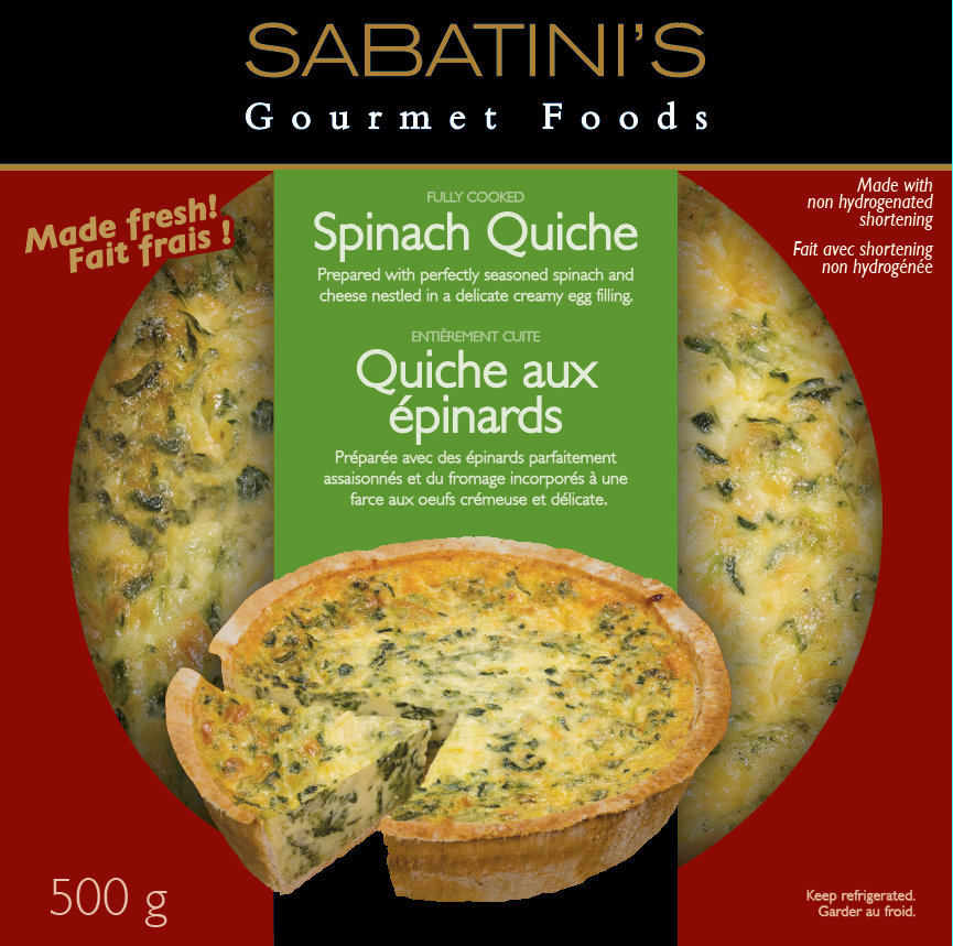
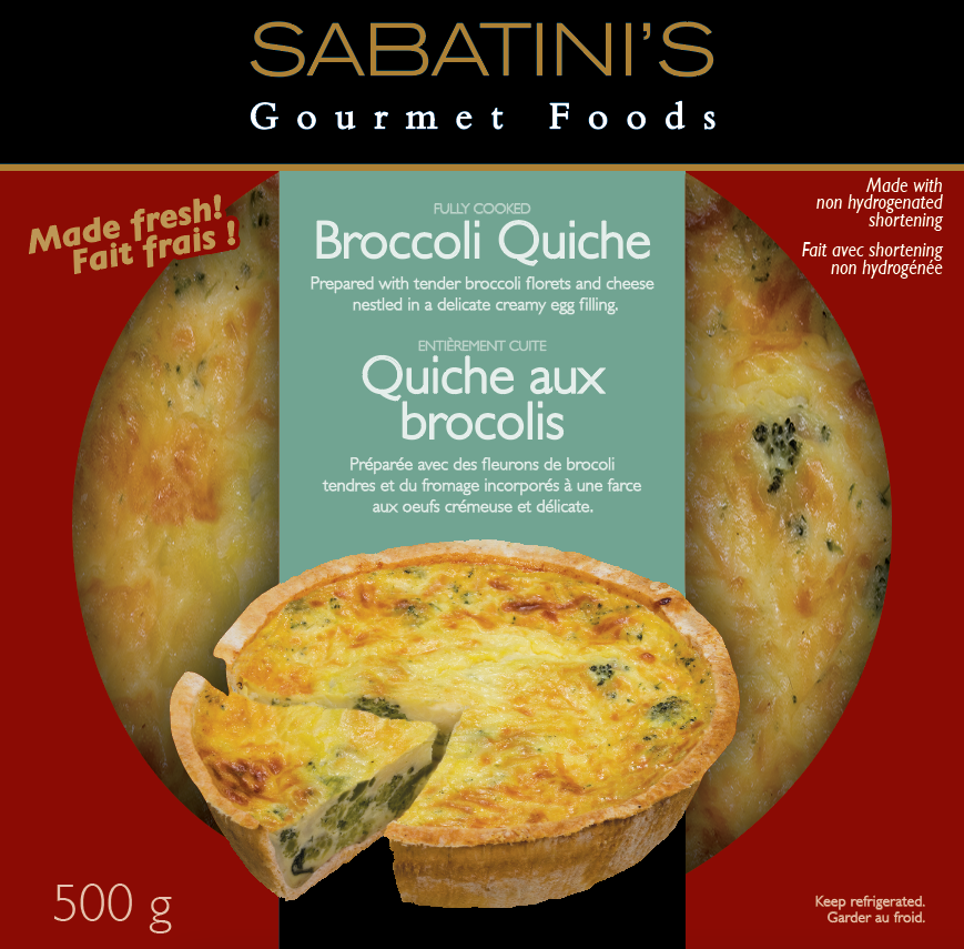
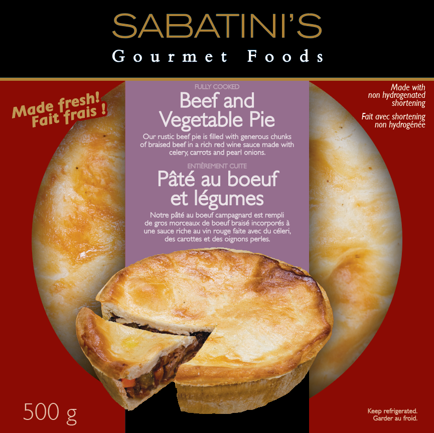
TOP SELLING QUICHE AT LOBLAWS!! Full branding exploration. Project launched with 4 different quiche skus + 2 meat pies. Hired the photographer, directed photography, complete package layout and delivered final docs to printer.
For this brand development, the client was a a well-established GTA food producer. As a family run business since the 1960s it was important to tell the Sabatini patriarch story and his Italian culinary training. The brand needed an upscale style to illustrate the prestigious cooking knowledge behind the brand, careful recipe development, and a high-quality product. This was established by the use of a very formal and symmetrical layout combined with with rich black and deep merlot red locked in with the gold lettering and frame line. The elegant thin brand mark lettering is framed by the thin gold line just beneath it, anchoring it solidly to the top of the principal display panel.
The window diecut was very unique on shelf, broke through the clutter of the 'farm-like' competition, with its strong formality and bigger view of the pie/quiches. The pies were photographed angled overhead and sliced to showcase the filling and crust. Actual pies were used fresh off the line, as the quality was superior and required no styled stand-ins.
Production challenge: avoid creating 6 separate dielines to optimize production and keep down costs. Solution: photographed all the quiches at the same angle, and then used the same crust photo for all of them and in Photoshop carefully replaced all the fillings.