

World Creations Branding
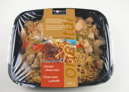
Created logo and established branding for line of international-style entrees. Stock photography was used rather than original photoshoot; this was a product test and so the client wanted to keep the costs to a minimum. Worked closely with the printer to ensure the design integrity and results on press. Products were sold in Canada
both at Walmart and Costco and performed well at launch.
The whole line was designed to depict global cultural flavours. Each of the cultural pillars were defined by using two cues: 1 watermark descriptor (Oriental/ Greek/ Mexican) + 1 colour (bronze/ blue/ green). From there each variant per cultural pillar was then assigned a unique colour per word descriptor, along with unique romance copy for each dish.
The "World Creations" brand mark was designed to depict a very literal culinary icon. Simple black was used to reserve a broader colour palette selection for the variants and cultural pillars. This optimized the label printing, reducing the plates needed across the wide number of variants.
Two stock images were used across the oriental line, one for the chow mien noodles and one for the rice, each one depicting the carbs as a base minus any proteins, simplifying the variant cue.
Spot colours were used for each of the cultural pillars and each variant. The watermark lettering over the photos was created with CMYK, simulating the same watermark effect over cultural spot colour. Worked closely with the printer to ensure the transition from spot PMS to the CMYK area was smooth and undetectable in these two key ares.


